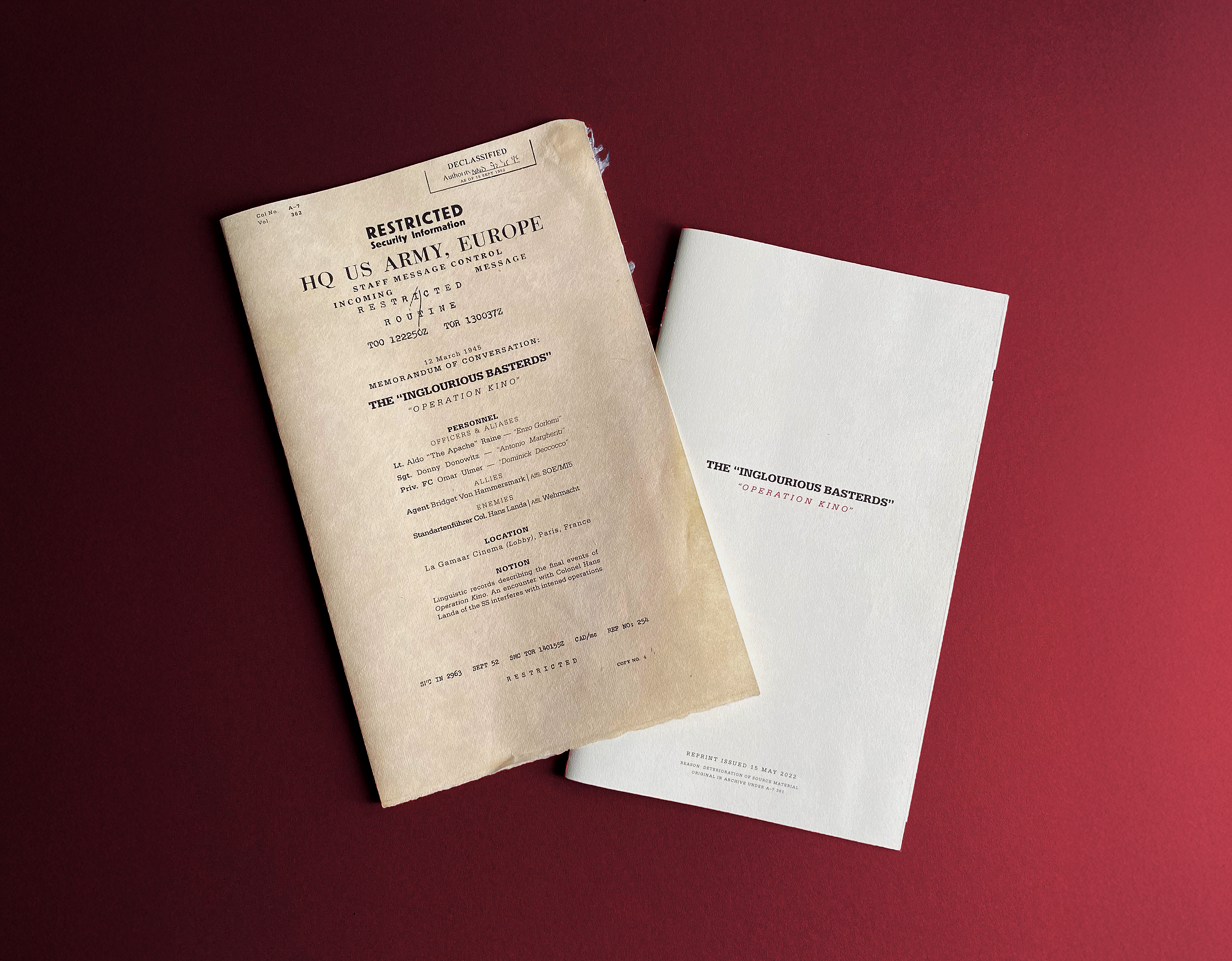
“OPERATION KINO”
A TYPOGRAPHIC INTERPRETATION OF DIALOGUE FROM “INGLOURIOUS BASTERDS”
HOW CAN TYPOGRAPHYVISUALIZE DIALOGUE? The relationship between type and image is central to almost all graphic design, so what happens when image is no longer a factor?
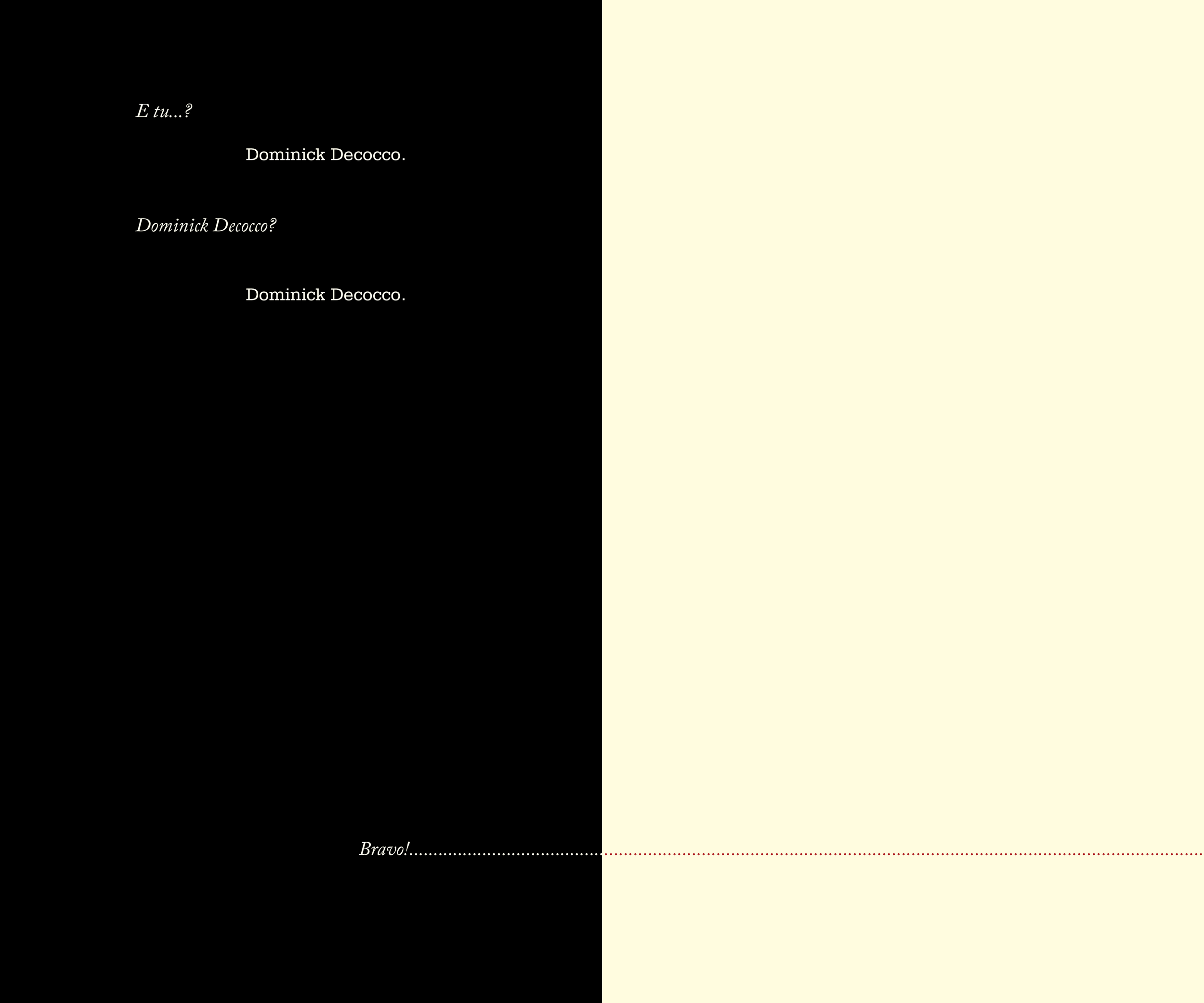
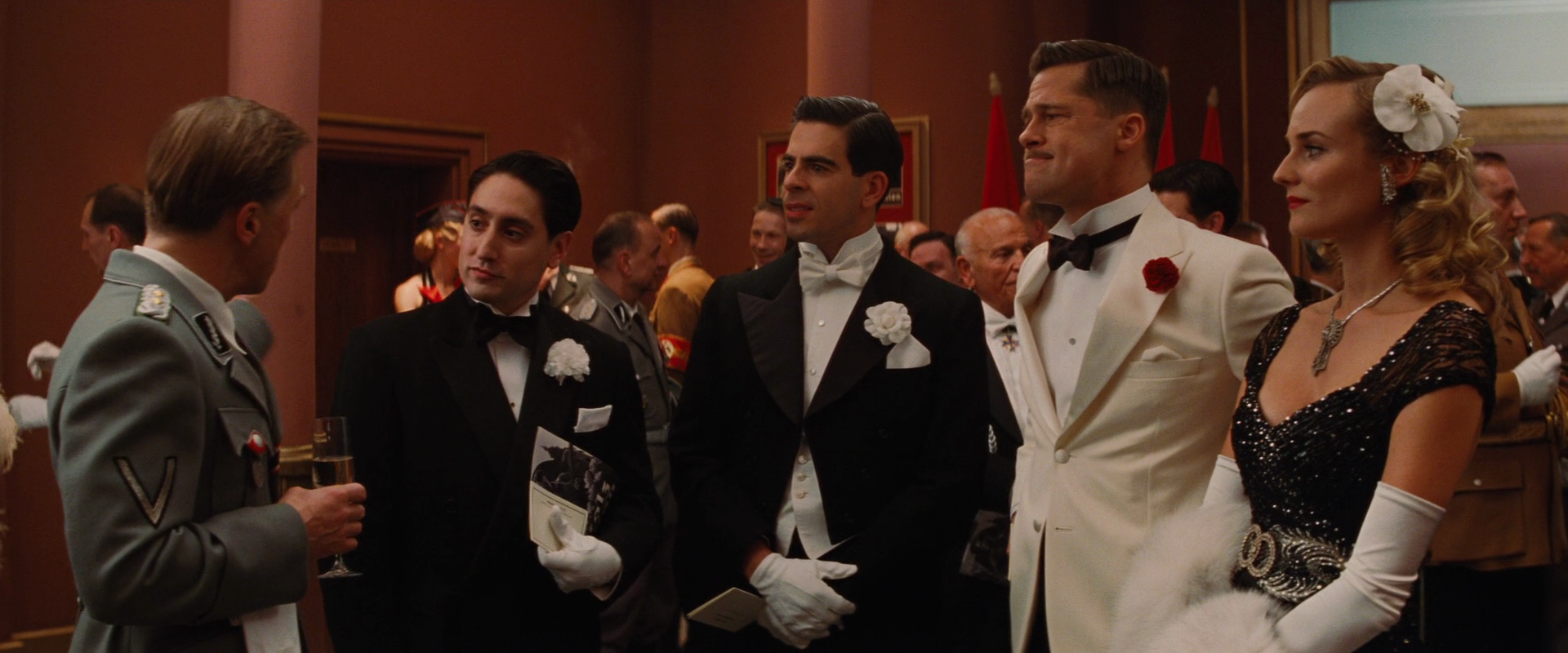
In the case of Operation Kino, an adaptation of the Italian scene from Inglourious Basterds, typography is forced to play every role.
Winner of 2024 Kaleidoscope Design Show: Advanced Typographics
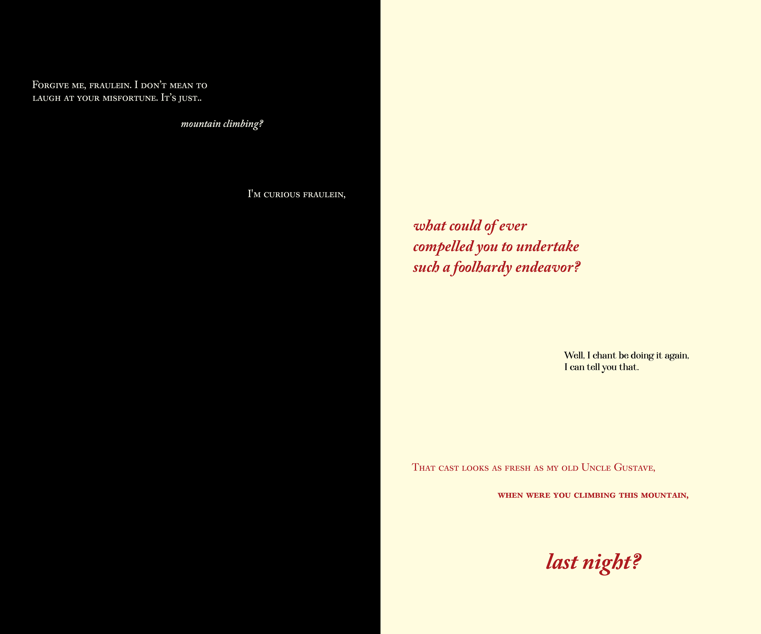
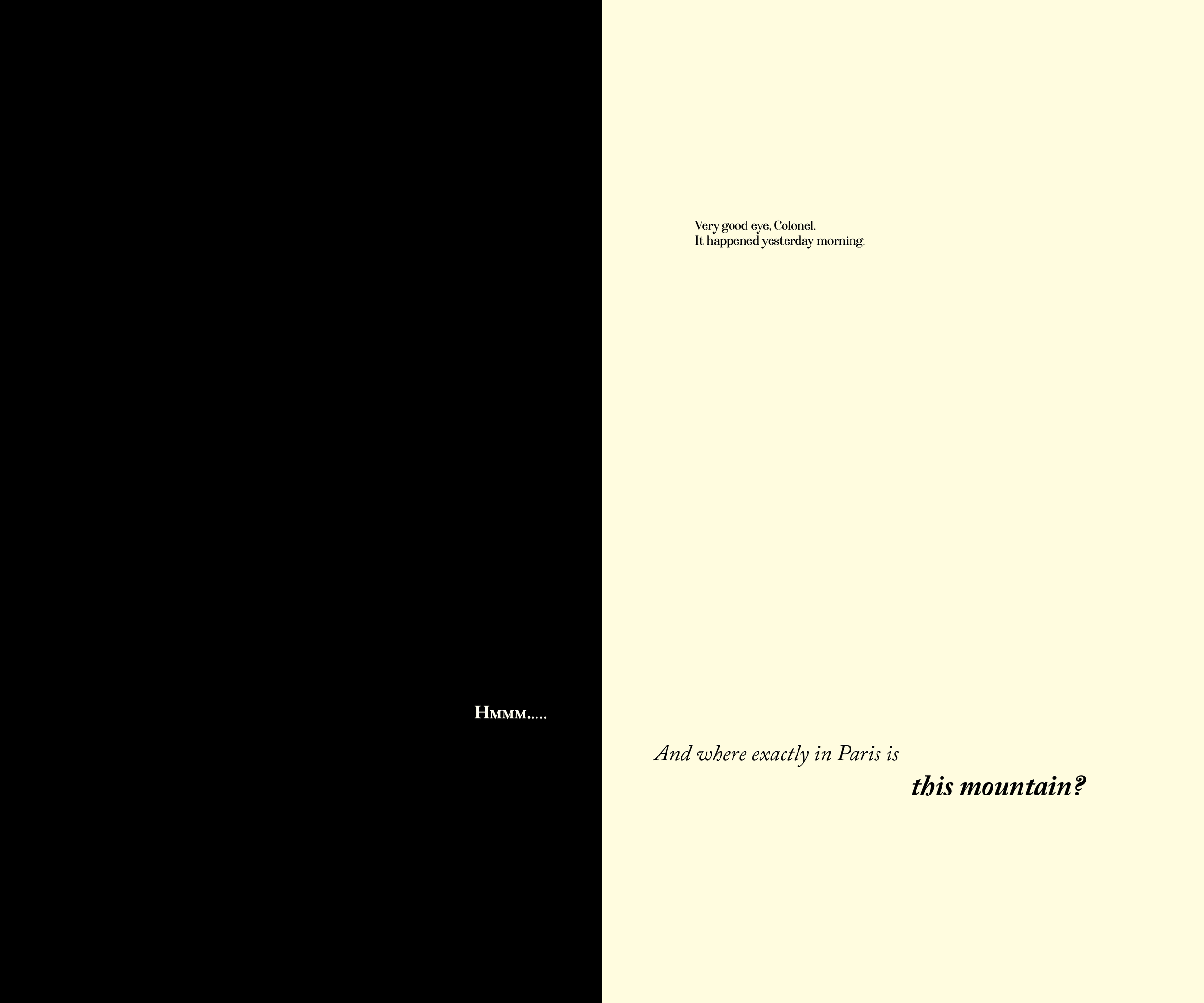
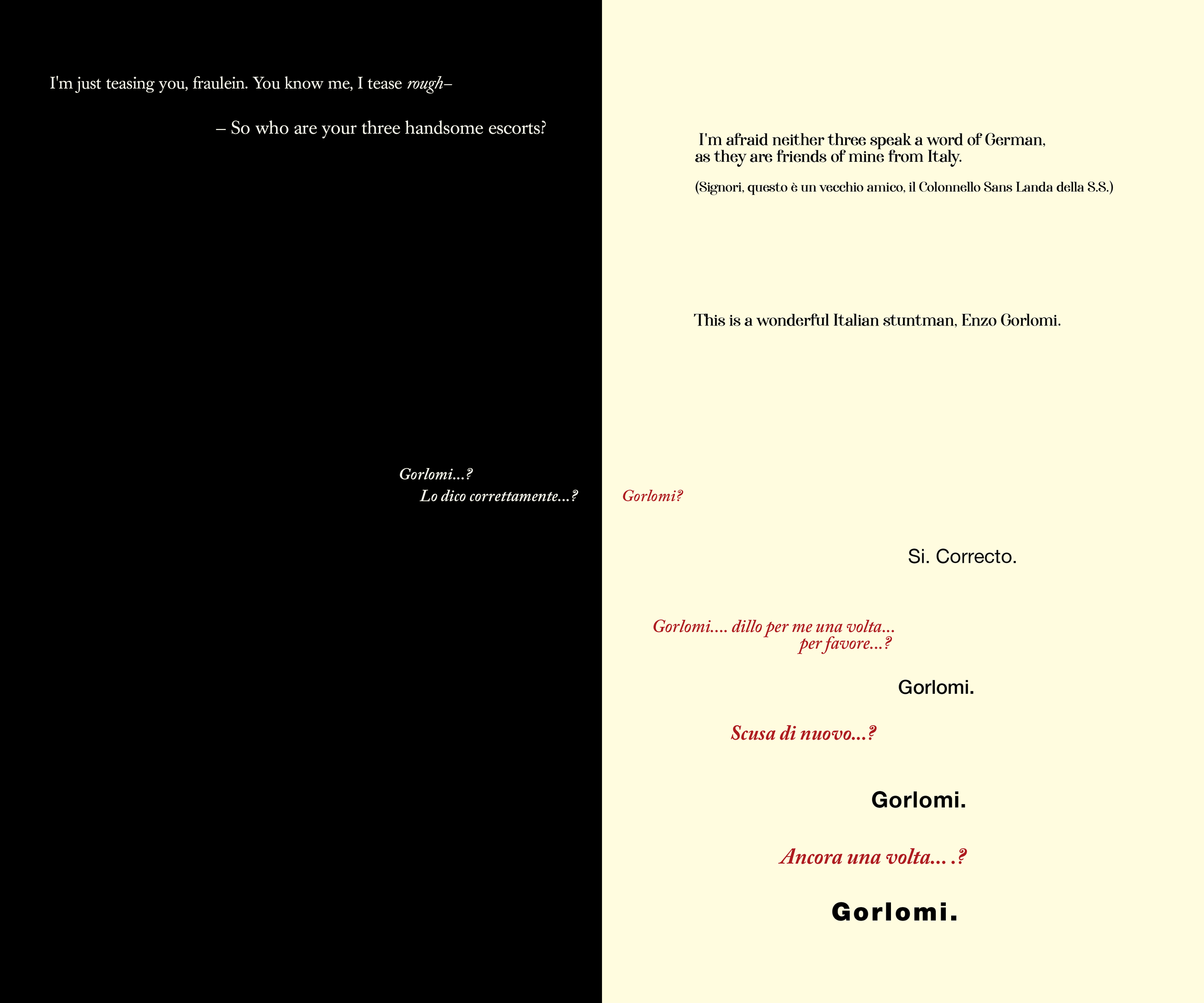
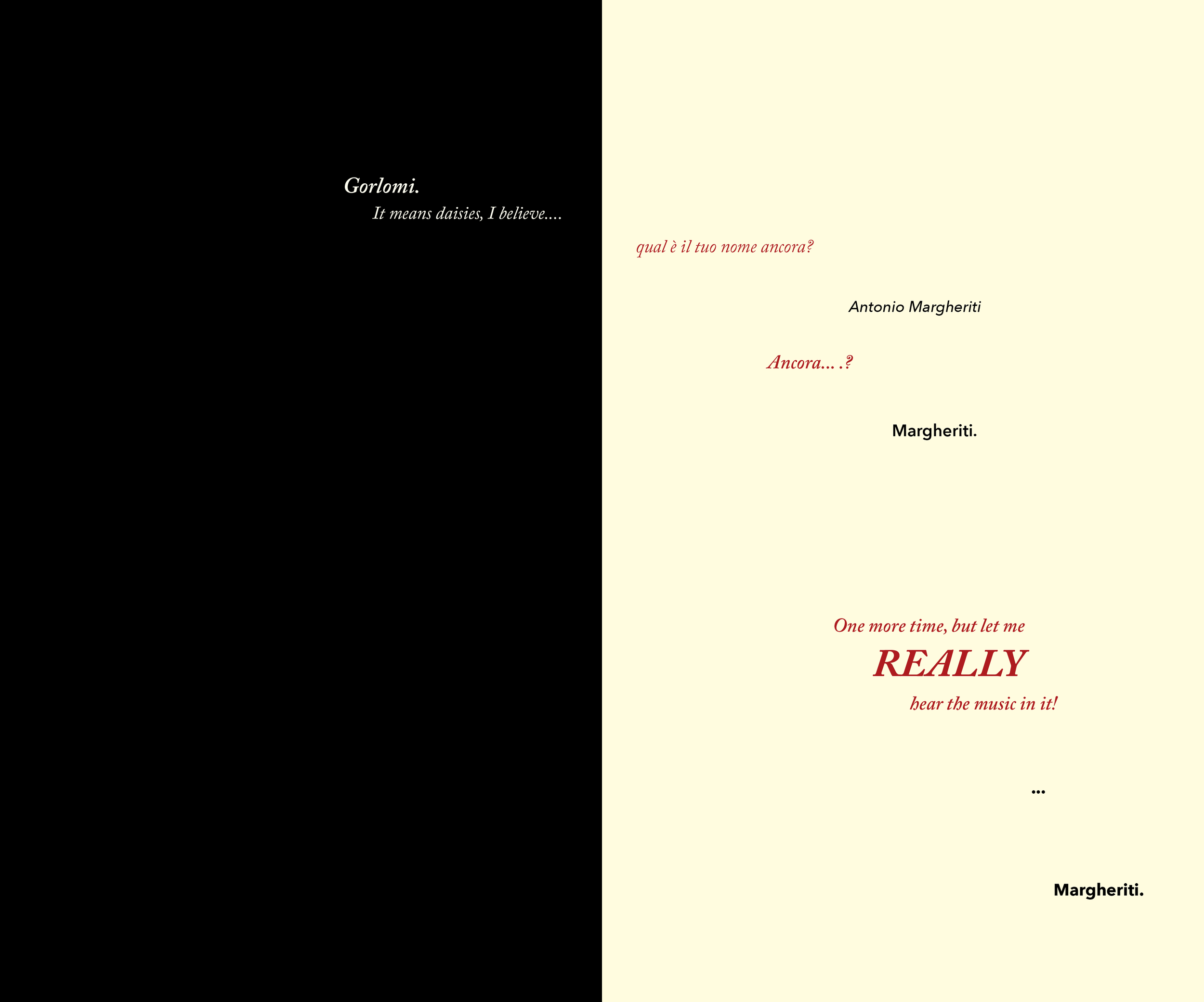
This booklet recounts a scene set during WWII, where four soldiers of the allied powers go undercover at a Nazi event in Paris. They select Italian as a cover nationality despite an absolute inadequacy at speaking the language, resulting in the antagonist, Nazi Colonel Hans Landa, catching on instantly.

SPREADS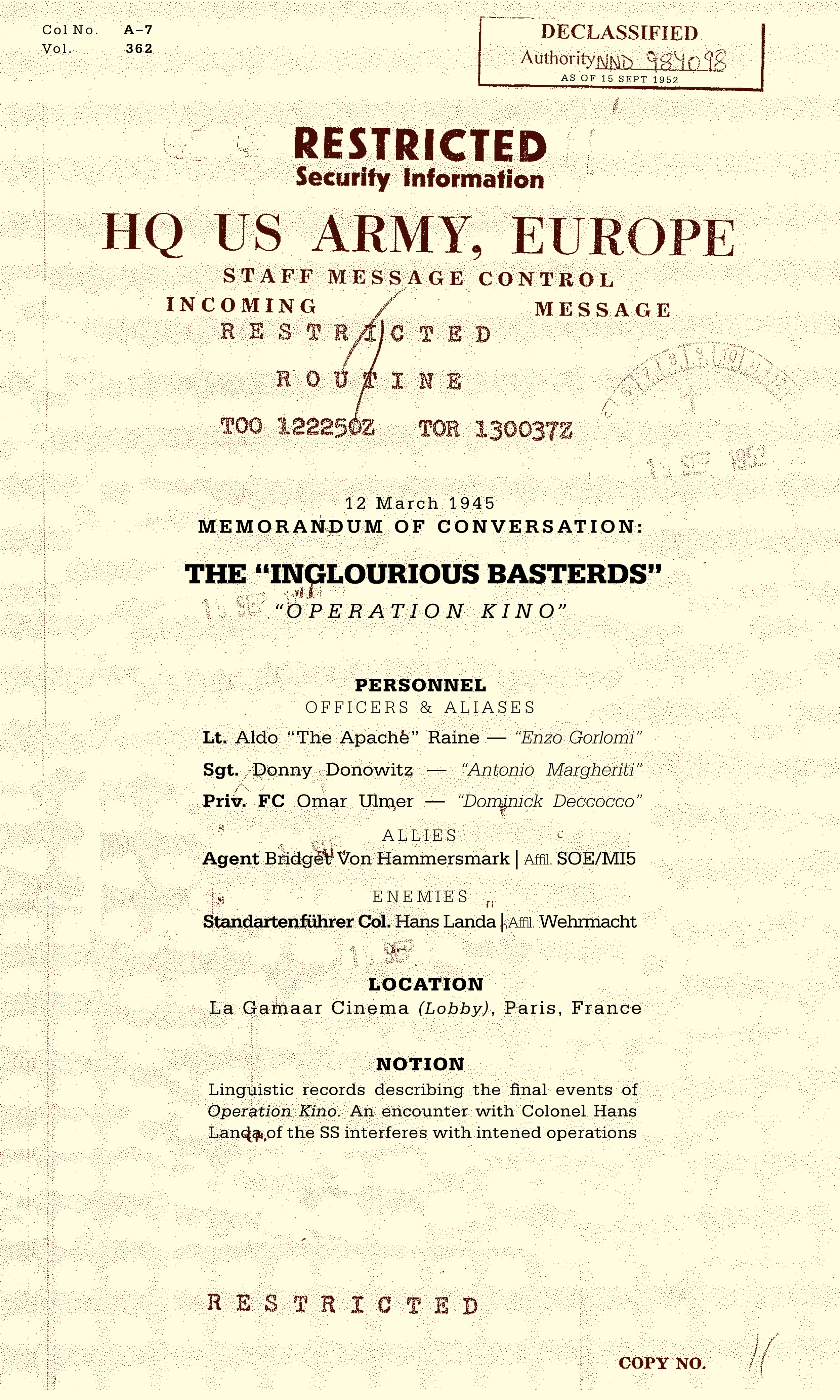
The cover imitates a historical memorandum of conversation, a document the US government uses to record important discussions.
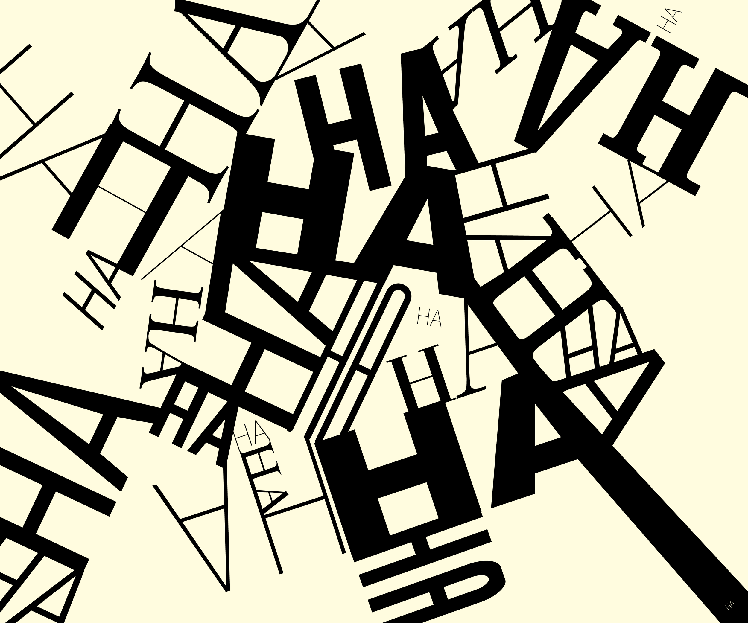
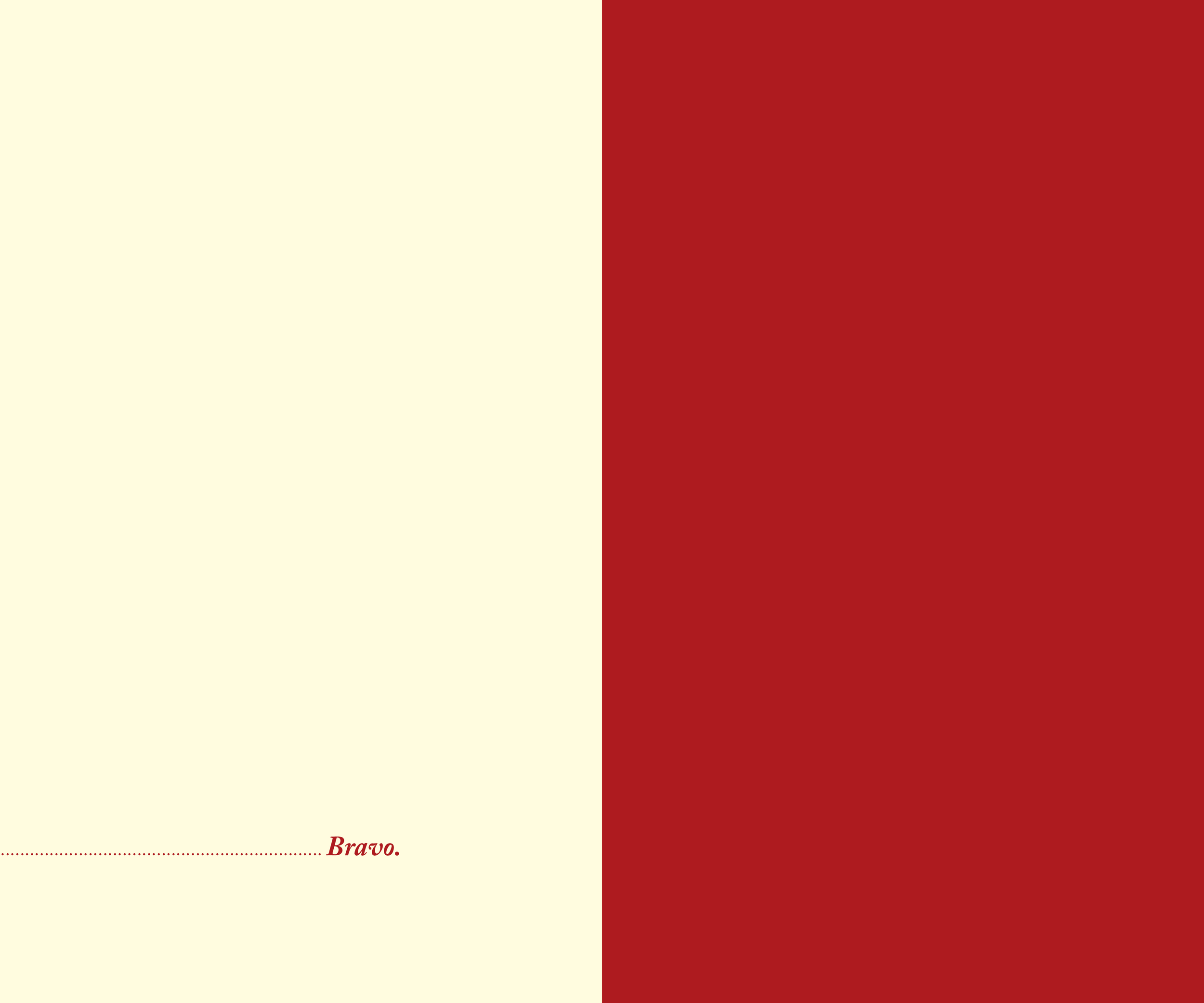
When the Colonel laughs hysterically, it's a very shocking and tense moment. This type collage interjects in the same manner.